 |
|
 | POWERPOINT ENHANCEMENT SOFTWARE |
|
|
|
|
 | |
 |
POWERPOINT MEDIA PRODUCTS |
|
|
|
| |
|
|
|
|
|
|
| SHOPPING CART |
 |
|
 | |
|
POWERPOINT HELP |
|
|
|
|
|
|
|
|
|
| |
|
|
|
|
|
 |

November 15, 2004 Edition Nr: 002
|
An IntroductionFrom the early days of flip overs and overhead projectors, presentations and more importantly the presentation of data, of key figures, turnover, profits, loss, and comparison values, have always appeared somewhat centrally within the corporate presentation.
As technology has evolved and its ability to move marker pen and acetate away from the presenters screen, to make way for PowerPoint, Flash, DVD, and content streaming. The presentation of data continues to be met, by and large, with an awkwardness within presentations, and still remains an area where the presenter must work most.
And yet the presentation of key facts and figures, of data, and values, is an area where visual aids and graphical design can be used to not only simplfiy complex data structures and information, but communicate clearly and concisely the differences in data and meaning for their inclusion within your presentation.
Through animating graphs or charts, your audience though not necessarily able or willing to digest key figures and data, will more easily recognise, see and comprehend, trends, differences, and overall projections of data. Enabling you to communicate to even those less attentive audience members, the direction, movement, projections, and results that most important and key to your speech.
|
Creating a chart using PowerPoint |
Though there are many third party plugin and chart enhancement tools available today, our focus is on the existing inbuilt default PowerPoint technology to create and animate your chart.
Open an existing presentation, or create a new presentation from the PowerPoint menu.
Insert a New Slide, selecting a slide layout which includes a chart.
|
|
 |
Screenshot of the New Slide option dialog window
from PowerPoint. The selection above indicates
three layouts with charts, with the selection of a
chart layout without text |
|
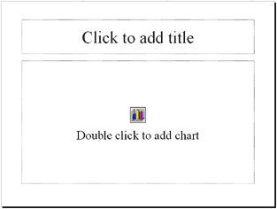
Entering data to create a table |
To begin entering data to create a table for your key figures and data results, double click the chart icon.
|
|
|
Entering data |
After double clicking the chart icon a chart layout will appear on the slide together with a Presentation Datasheet dialog box which contains the data for the chart within the slide.
The layout, color scheme, and names of the chart elements are simply those of the default template, and will be changed by you for your our key figures, chart and scale information.
|
|
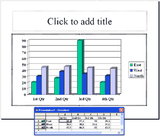 |
The chart layout and active Datasheet
|
|
When entering your data, I strongly advise that you only change a few cells at a time, replacing data on a cell by cell basis. Try not to delete all of the data at once. As you enter your data, the chart associated with the Datasheet will change and update automatically.
Deleting everything before you begin can often cause confusion, not knowing where the colored names, and data of your chart should be placed.
Add as many additional columns and rows to your datasheet as your graph is required to show.
|
|
Formatting your chart colors and legend |
After entering your data and key figures into the Datasheet, you can choose to either change, alter, update, and revise the colors of the chart elements and legend at this point, or close the Datasheet and then make changes to your chart's palette as you wish.
To change the color of any individual bar, or chart segment, before closing the Datasheet, right click bar's legend, or associated colored cube on the right hand side color map, and select "Format Legend..." from the dialog options.
A Format Legend dialog box appears with Patterns, Font, Placement, and color selections for you to select for the chart segment. Select your preferred settings for the element, and repeat for all other remaining elements of your chart.
To format the colors of your legend and chart elements after closing your Datasheet, simply double click the chart and right click the element that you wish to format according to your palette and pattern style.
|
|
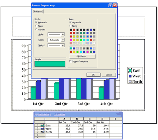 |
The Format Legend dialog box allows you to
format the elements of your chart.
|
|
Animate your chart |
To animate your chart, select "Custom Animation" from the Slide Show main menu option.
|
|
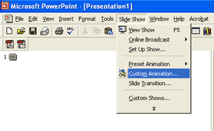 |
Select Custom Animation.
|
|
- Check the box chart beneath Check to animate slide objects: on the Order & Timing tab.
- Select the Chart Effects tab.
- Check the box beside Chart
- Select how you would like the chart elements to be presented. All at Once, By Series, by Category, etc.
- Select an Entry animation.
- Select a Sound if you wish to support your chart animation with sound and effect.
|
|
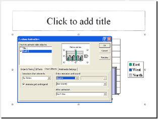 |
Adding animation to your chart.
|
|
When you have completed the settings that you feel are most apt to your chart, select the Preview, to view the chart animation, timings, and styles.
Experiment, alter, change, and make any adjustments, corrections, and updates to your chart's animation before pressing OK when you have the animation as you need it for your presentation.
|
|
A final touch |
Using Order & Timing allows you to select the speed of animation for each part of the chart that you want to be displayed.
On the Order & Timing tab, within the Custom Animation dialog box, select Automatically, and use the up and down arrows to adjust the timing in seconds between each part of the chart displays.
With a little experiment, you'll find the extra dynamism you are able to achieve so that you charts movement and actions support your speech and visually underline the content of your topic, for examly growth, reduction, balance etc.,
|
|  |
Adjust the timings of each chart element individually.
|
|
To conclude... |
Using animation in charts is one of the simplest yet most effect ways to communicate otherwise intensive key figures and data to an audience.
As presenters our goal is not only to provide our audience with credible information, knowledge, and insight, but to share our understanding of often large, and intensive amounts of data and trends.
Through the use of simple yet easy to recognise animation, an audience can view trends, data rollout and scales, and understand the general direction of figures, without the need to listen to each line of data and mentally build a chart of information.
PowerPoint's own default graph and chart settings, though somewhat simple in design, can be used to gain extra and added effect in your presentation to visually underline the key data and figures of your presentation.
With some experimentation, you can quickly and easily test various settings and profiles to see which style, speed of movement, and direction, best matches the overall message of your data, and help communicate to your audience the power of your message, rather than their need to be attentive to every number that you speak, allowing them to more easily relax and absorb the information that you are sharing through your presentation.
Scott Harvey, Managing Director The Impossible Media Group
|
|
 |


|
|
|
|
|
|
|
|